Wednesday, 7 February 2018
Tuesday, 6 February 2018
Monday, 22 January 2018
progress report- website
 |
| This is the updated home page for our website. I experimented with different combinations of colours for the text and logo at the top of this page but finally decided this combination highlights the important information four audiences perfectly, and makes the album name stand out. I used a video that i filmed of the playground which is also in our music video so this creates a clear link between the two platforms. Using a video creates a more interesting experience for the audience, and as the text on this page is simple, it doesn't overcrowd the screen. |
 |
| This is our merchandise page, which is clearly incomplete at this stage whilst Tom is working on the products. I decided to make the title of this page a joke which uses the name of the band in it. I did this because the mode of address between our band and our audience is friendly and humorous. I want the relationship between the band and the fans to reflect that of the brotherly relationship between the band members themselves. |
 |
This page is basically the same as it was at the last progress report, although i've added more writing so that the two paragraphs are symmetrical which looks more neat and professional. I need to add the image of the three band members at the top of this page and then it will be completed. The information on this page explains how the band met, and what their aims are as a band. It also has some information about the Ska genre. I've written it in a way that makes it sound like the band members are talking to their audience directly by using "our" and "we" and so on, which is something i've used throughout the website.
|
 |
| This page is where the fans can listen to some previews of the songs in the album. I added another jokey comment at the top of this page which is similar to the one on the merchandise page. I need to change the image of the feet in the slide at the top of the page. I will later add a picture of the album cover to the image space next to the music, and change the names of the songs to match the ones on the track list on the back of our digipak. |
 |
| This is our tour date page. After researching appropriate locations for our band to perform, i made an interactive changing slide show which informs fans of up coming events. I have added two buttons, one of which reads 'buy tickets', which when clicked, takes you to the home page of ticket master. The 'location' button takes you to a google maps page with the location of the event. |
 |
Our gallery page is simplistic and clean looking. Our images are all in black and white to fit the colour scheme of our band, and to make this page more neat and professional. Some of these images are behind the scenes shots from our filming days at Kingston Uni, some are more professional images of the band.
|
 |
| This is the contact page of our website. I used a simple background for the slide at the top of the page which fits in with the colour scheme in a subtle way. The title of the page sits above the social media icons for the band's social media pages. Under this i've put in a subscription bar which you can actually fill in, although this is just for show as the email entered will not receive any information etc. |
 |
| Under the subscription bar, i've created a list of people to contact for enquiries, their names, position and emails. These are all fake names etc but give the page a more realistic look. |
Progress report- logo completed
We have completed the design for our logo, which will be used across our digipak and website. We focussed on an aspect of the costume, specifically the sunglasses that are worn by the band in the video. We wanted the logo to have a simple look that was basic and easy to fit into the website pages and other areas of our final products. We took the basic outline shape of the sunglasses, and added 3 lines of reflection on the corner which is supposed to represent the 3 band members and their closeness.
Logo research
When starting to think about the logo for our band, I will focus on the main objects or ideas that are associated with the group and the music video.
The objects/ props/ costumes that are featured the most are:
The objects/ props/ costumes that are featured the most are:
- A tie
- Suits
- Sunglasses
- Ska hats
- Saxophone/trumpet
- Ruler
- Brotherhood symbols
The Specials' logo is black and white, which is what we want our colour scheme for our band to be, as this fits with the rest of our general theme. Their logo also features the name of the band, this is something we're not planning to use in our own logo. Their logo is quite simplistic which is an aspect we are planning to include in our logo too. |
 |
| Madness's logo is probably the closest to what we're aiming for in our own logo. It's simplistic look and symmetry is something that appeals to me when thinking about the logo we will use, along with the common black and white colour scheme. |
 |
| This logo also focuses on the name of the band which is something we're not planning to do. Their logo is quite detailed which also isn't something we're planning to replicate in our own logo. However, their black and white colour scheme is an aspect that we will take from this logo. |
Digipak research


All of these Ska band digipak's have a monochrome colour scheme, all with a slight splash of colour, generally red. The actual aesthetic of these digipak's differs quite dramatically, with some featuring just one person, and some featuring the whole band. We are planning to include the whole band on the front of our digipak, as we want to portray the same sense of brotherhood that is highlighted across all of our products. On the other parts of our digipak we will have the individual band members, as the digipaks in this genre seem to be more people-based rather than objects or other images. The backgrounds of these digipak covers is also very plain, which we will use ourselves.
Sunday, 21 January 2018
Tour locations for website
Bands like The Hunna have performed at Brixton Academy, and as they are also a fairly new band this could be a possibility for a location for our tour page. These locations will all be in the UK, as this is where the band is from and they wouldn't be popular enough yet to have a high international demand.

Since our band is fairly small and up-and-coming, with Lost Art being their first album, the locations for their shows will be quite small and basic.

Kentish Town forum is also a smaller gig location, which would fit with our bands growing audience. This has also been the location for Madness' tribute band show.

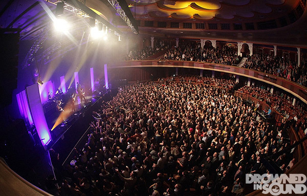
The Boiler Shop in Newcastle has been the location for multiple Ska Bands, most recently The Dualers, who have a show there soon.
A Ska band called The Selector and The Beat are performing at Brighton Dome in March, so this could be an appropriate location for one of Common Decency's shows.
Subscribe to:
Posts (Atom)